
HIT Diary Study Case
A solution to track your histamine intake easily
By Deborah Rodriguez Breton
Introduction to the problem
As compared to gluten, lactose, or sugar intolerances, histamine intolerance (HIT) is a relatively unknown condition. The same holds true for mobile food diaries, as there are no apps yet available for people suffering from HIT and the very specific needs that go along with it, including keeping a food diary. However, having an analog diary isn't practical since people tend to forget to carry it or to remember later to jot down the meals, times, and symptoms accurately.
Additionally, following a low histamine diet is difficult as a lot of common foods contain high levels of histamine and planning a meal can be challenging without a list of safe ingredients with a low histamine index.
My role during the UX process
For this project, my responsibilities were to do user research, user interviews, journey mapping, sketching, wireframing screen, flow journey maps, visual design, interaction design, user testing.
1. Product definition
HIT Diary App is a solution designed to help people with histamine intolerance improve their understanding of how their ingested food impacts their symptoms so that they can eat well without experiencing discomfort.
The App allows prospective users:
-
To log their habits easily and quickly by tracking foods, triggers, symptoms, and relievers.
-
Have a quick overview of their daily histamine intake.
-
Set up reminders to record the meals and symptoms on a regular basis.
-
Analyze the collected data to identify potential triggers.
-
Create reports for sharing with doctors, nutritionists, or anyone wanting to learn more about their eating habits.
Helping you to understand your body
The HIT Diary App helps people who suffer from Histamine Intolerance to track their meals and symptoms by avoiding unpractical paper and enabling them to monitor their histamine levels throughout the day unlike any other food and allergies diaries in the market.


2. Research
Topic Research
Market Research
Competitor Analysis
User Research
Competitor analysis findings
-
Apps for controlling histamine do not exist
-
There are well-known paths for tracking food
-
Most food intolerance apps do not offer enough filters to add symptoms and foods to the list
-
The apps lack predictive functionality, suggestions, and auto-filling over repetitive tasks
-
Databases are limited or regionalized
-
Many food diaries take a healthy lifestyle approach, while very few of them take a medical approach
Users research findings

-
HIT isn't the only intolerance associated with diseases where HIT is a subset condition
-
Symptoms vary and affect different systems
-
Patients with HIT must monitor their meals and symptoms regularly
-
A digital diary is preferable to a paper diary
-
Symptoms are recurrent with specific triggers
-
Lack of time or forgetfulness makes keeping a diary difficult for users

3. Analysis
As part of the analysis phase, many artifacts were created, such as personas, user scenarios, stories, journeys, flow charts, and sitemaps, which helped me empathize with my target group and determine their goals.
User's goals
Help me to understand
Users need a solution that helps them track foods and symptoms in a diary without forgetting, in order to be able to learn about their bodies while building healthier habits.
Let me share my story
Users need a tool that allows them to track their meals and symptoms so in case of need they can share in detail with their people of confidence.
User flow map - Main persona
.jpeg)
Information architecture


4. Design
The first step in this phase was to define the design principles of my app, these statements later allowed me to create the first sketches, wireframes, and subsequently, they turned into a design system that resulted finally in a high fidelity interactive prototype.
Principles

Consistency
The design should generate familiarity and enhance intuition by applying the same solution to the same problem.

Personal
The design should facilitate a space for the users to express with specific keywords and identifiers private information and states.

Awareness
The design should enable the users' self-observation, understanding, and ultimately allow them to adapt.
User interface


Prototype and features
Onboarding
The onboarding process was designed to allow users to quickly grasp the functionality of the main features of the app, including tracking, editing and deleting entries, and the histamine monitor.

Track foods
The purpose of this feature is to provide users with an easy way to add entries to their food diary. In the main navigation bar, a prominent green button allows them to quickly find the main functionality of the app while further in the process, smart food predictions provide them with suggestions based on their preferences and previous entries, so they can save time and effort while logging meals.
Track symptoms
In the same way that the food log works, the symptoms tracker provides a quick and intuitive way to add symptoms based on the preferences set up by the users previously and also from the insights gained from learning from their habits.
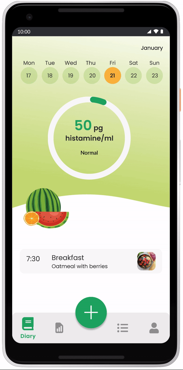
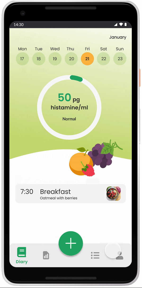
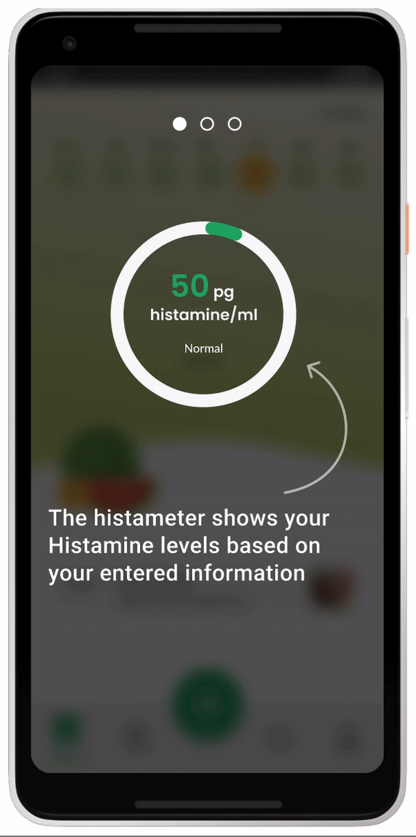
Histameter
Users can use this feature to better track their daily intake of histamine. The histameter uses the database of foods and ingredients of the app as a reference and calculates the levels based on the food logged and the relievers used to lower histamine spikes.

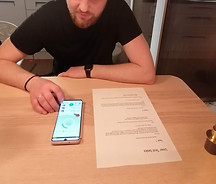
5. Validation (testing)
To finish the process, I conducted a series of A/B tests in which some users went through the prototype and executed tasks with the previous onboarding flow, while others did not. Ultimately, I asked a series of questions to collect feedback to see whether or not the design works for them and where things could be improved.

User test 1

User test 2
User test 3
Findings
-
The prototype was found to work well,
-
Formerly onboarded users found the app easier to use than those who weren't
-
Flows were clear, and users were able to successfully complete the tasks
-
Visually supported information is always effective
-
People use the smart suggestion chips rather than the input fields
-
Minor UI revisions could be implemented