
1. About the project
Team: Debbie Breton, Oskar Gahler, Simon Moos, Tabea Schwaiger, Mathilde Spitzer
Duration: 7 weeks
Tools: Pen and paper, Miro, Figma, Google Drive
BIPA is Austria's largest drugstore with over 600 retail stores and more than 4000 employees. They also provide an online shop, accessible via the web or BIPA’s mobile app.
The problem
BIPAs mobile app is struggling with a high bounce rate and a low conversion rate (exact numbers undisclosed). It is currently not consistent with the existing design language and brand guidelines and doesn't bring any additional value to the customer’s shopping experience.
In cooperation with the Talent Garden UX Design Bootcamp, BIPA gave a project brief with the aim to create a new mobile solution based on PWA (progressive web app) technology that provides meaningful value for both the customers and the company.
BIPA's goals
-
Activate mobile users through additional functionality
-
Increase conversion rate
-
Use possibilities of PWA technology to improve overall user experience
-
Support users in finding the right products, enabling them to save time and money
2. Product definition
Context of use
As a starting point to our project, we formulated a Context of Use Description (CoU). Since we all are familiar with BIPA, we first did this on the basis of our assumptions in a brainstorming session. The purpose of doing that was to provide a clear reference point for comparison. We came back to this first version of the CoU later, in order to update the document with the knowledge gained from the qualitative interviews. This way we were able to validate and/or falsify our assumptions in order to arrive at a clear picture of the frame in which we were going to design our solution.

We used this checklist to (a) define the product we were going to design, (b) identify the potential user groups, (c) their goals and (d) tasks as well as (e) the environments in which the product will be used.
User requirements
From the goals and tasks sections of the CoU we formulated user requirements which functioned to further specify the functionality that the app needs to provide in order to serve the user's goals. Since our goal for this project was to design one or two features for the app, we did not formulate an exhaustive list of requirements. Rather we focussed on the most important topics in order to find the functions that would provide the most value to future users.
Examples:
-
With the BIPA app, the user shall be able to find needed/desired products.
-
With the BIPA app, the user shall be able to find discounts that apply/fit their shopping.
-
With the BIPA app, the users shall be able to inform themselves about the ratings of products.
User groups
One particularly valuable insight gained from the Context of Use Description was the user groups we were able to define from it. These user groups served as a basis for constructing personas and in turn guided all of our subsequent designing of specific features for the app. The two user groups we decided to focus on for this project were:
-
the Loyal Customers who have been shopping at BIPA for a long time. A primary motive for them is familiarity, both for the brands and products offered at BIPA as well as the BIPA brand identity
-
the Busy People who want to spend as little time shopping as possible. Anything that saves them time is valuable to them
Value proposition
In order to communicate our idea of the value the app should provide to the users we formulated two value propositions, each of them tied to one of the user groups.
-
For loyal BIPA Customers, who know their needs and interests, the BIPA App is the service that enables them to streamline their shopping experience.
-
For busy working people, who need to fit their shopping into a tight schedule, the BIPA App is the tool to integrate the experience into their day.
3. Research and analysis
Research
In order to validate our initial assumptions and to provide an empirical base for the following phases, we started our process with an intensive research phase using the following methods:
-
Competitor analysis
We compared different mobile app solutions within the drugstore sector as well as in the general category of online shops.
-
PWA analysis
In order to be aware of all possibilities and constraints of PWA apps, we looked at the technical details and best practices in this field.
-
Interview
We conducted 11 interviews with adults aged between 29 to 61, from whom 7 are females and 4 males and 2 have kids and 9 don’t. We wanted to find answers to the following questions:
-
Why do people shop at BIPA?
-
What do they buy there?
-
How do they make the decision what to buy and when to buy it?
-
What pains and gains do they encounter regarding their shopping?
Our main interview takeaways were that users …
… want familiar products.
… prefer specific brands/products.
… don’t want to spend too much time and effort shopping.
… want to know if the quality/value of the products meets their needs.
… want to use their shopped products immediately.
Analysis
The research served as our foundation to create personas, user stories, and user journeys.
With the gained knowledge we created 2 user groups and 2 personas, each roughly corresponding to these 2 user groups.
Personas: Caroline Mayer, Clemens Markovic
Gains: Familiarity, Socializing, Living Sustainably
Pains: Mobility, Time Constraints, Limited Choices
Jobs: Find out about new offers, find out about a new product, find detailed information on products, keep track of their purchases and products of need and interest
To build a basis for the next step, we created a user story for Caroline and a corresponding user journey map.
"Caroline found the right type of diaper for her baby and saves it as a favorite. She likes to keep things organized and therefore puts the diapers into her “Baby stuff” list. Since having kids is an expensive business, she sets the notifications on her “Baby stuff” list to not miss any special offers".

4. Ideate
Based on our findings in our research we started to ideate on what features might be useful for the users. The interviews we conducted as well as the competitor analysis gave us a good foundation to find solutions to the problems we uncovered.
A quick reminder of what the main findings were:
-
Familiarity
-
saving time
-
personalization
Solution N°1 - The list feature
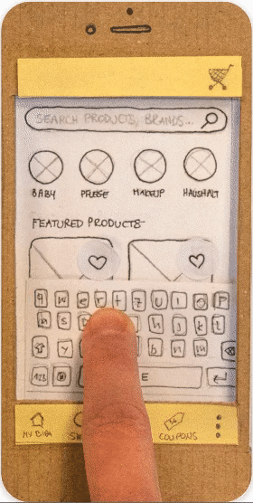
The first solution we decided to flesh out and put to the test was what we called the “list feature”. This feature would allow the users to save and organize products they frequently buy into lists and give them away to purchase those items with a few actions.
For this feature, we built two paper prototypes that were tested with five people. You can read more about this process in the section “Testing Phase I”
Solution N°2 - The personal filter quiz
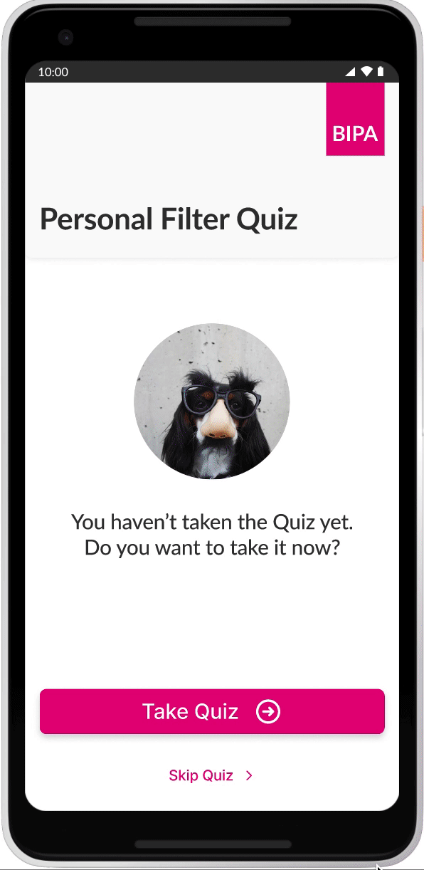
The other solution was the “Personal Filter Quiz”. This feature allows the user to set preferences which influences what kind of products are being presented to them first before others, thus making the search for products quicker.
5. User testing
Usability testing with the paper prototype took place on December 2nd and 3rd 2021 at the Talent Garden Campus.
We tested five users and used two versions of favorite list architecture. The setup included one facilitator, one human computer that operated the prototype, one note taker and two observers that operated the camera and took pictures.


Some users struggled with the paper prototype and noted that they found the transfer from the physical paper prototype to a digital product hard to master, especially since the prototype was only in black and white and icons or certain elements they had to interact with didn’t stand out like they would on a digital prototype.
Apart from that, the main findings were:
-
Instant system feedback was appreciated and well understood
-
Users want to visit the product page
-
Consistency in wording, labels and icons is a must
-
Advanced list features need introduction
6. Design
Design principles
Prior to creating a design system, we determined first the principles on which our design is based by analyzing nielsen’s usability heuristics and creating mindmaps to narrow down the keywords on which those principles are funded.
-
Cleanliness
The design should focus on necessary things and not confuse the user with irrelevant information.
-
Structure
The design should make it easy for the user to find their way and features.
-
Feedback
The design should give clear and instant feedback to allow users to feel their actions are registered.
-
Intuition
The design should feel effortless. It should allow users to achieve their tasks and goals through different paths.
-
Familiarity
The design should take the needs and preferences of different users into account and provide an informal and personalized space. The app experience should be like coming to a familiar place for a personal shopping experience.
Design system
Based on our selected principles, we choose Lato as our typeface because it’s cleanliness, straightforwardness and symmetry. Furthermore, it comes in a very wide range of styles, making it very relatable and approachable to users.

In terms of color, we kept the original Bipa colors for familiarity and to stay in brand.

7. Prototype
If you are interested to interact with the prototype you can scan or click the links under to redirect you to the features.


8. Validation
User testing II
On December 22nd, user testing was conducted on site and remotely at Das Packhaus in Vienna. Five users tested both flows which resulted in ten user tests in total.

Overall, the prototype worked successfully and every task was completed without major problems. Resulting from that, some small improvements and minor design revisions were implemented to the final prototype.
As further exploration, more elaboration of the personal filter feature was determined.
Conclusion
Using all the methods and tools we learned in this UX Design Bootcamp, we feel confident that we were able to create features that are useful to the BIPA App users and bring a value to their experience using the app.
Testing our assumptions was a major key in every step and enabled us to iterate the product in a better direction.
Good communication was the foundation of the whole collaborative process.
As a team we quickly found a good rhythm of discussing things and making decisions efficiently. That way we were able to meet all our milestones and keep within the set plan.
It was an enriching experience to work in the Potato Potato team and we would like to work together in the future.